
Image Building Block allows you to add images to your Graphics. You can choose to insert static or dynamic images such as user post avatars.
These images could be for example your TV channel logo, sponsors, user avatars in the case to show social content, or if you have built your lower thirds or backgrounds as images/animated GIFs in an image editor software you can upload it as well so you don't need to start building your graphics from zero.
The supported formats are:
JPG
PNG
Animated GIF
SVG
WEBP
The maximum supported size is: 5 MB
Remember, an Overlay will be created automatically if you didn't add it to Tree after adding an element.
To learn how to add elements to the Tree, click here.

Properties
Use the Inspector, right-sidebar, to customize the Image:
Image
Image

Source: Use it to upload an image or animated GIF.

Click on Source to enable the Show on Remote Control option so you can change or remove your image from the remote control during the live operation.

Fallback Image: Set a default back-up image. Use it when working with dynamic images such as user post avatars. So in case, the user avatar is empty the fallback image will be displayed.

Image Size: Use it to set the image size as:
Fit: The image will scale until it gets contained on the Container’s Width or Height, keeping its original proportions and not cropping.
Fill: The background will scale until it covers the entire Container’s area, keeping its original proportions, but getting cropped if needed. You can use the position controls to move that cropping window.
Stretch: The image will stretch to fully cover the entire Container area, losing its natural proportions. No positioning adjust is possible in this mode.
Natural Size: The image will be displayed on its original width and height in pixels.
Image Position: Allows you to set where the Background Image is placed. This option is not available for Image Size: "Stretch".
Position and Size
Position and Size

Position: Change the Image position inside the Canvas according to the X and Y axis (in percentage relative to the configured screen resolution).
Size: Change the Image size inside the Canvas according to its width and height (in percentage relative to the configured screen resolution).
Appearence
Appearence
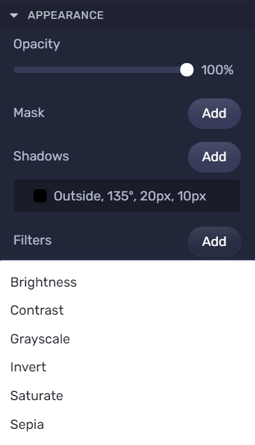
Opacity: Use it to change the transparency percentage of the Image.
Mask: You may add a mask to your image. For more information about Masking, click here.
Filters: Define visual effects to an element, like:
1. Brightness: Adjusts the brightness of the image.
0% will make the image completely black.
100% (1) is default and represents the original image.
Values over 100% will provide brighter results.
Note: Negative values are not allowed.

2. Contrast: Adjusts the contrast of the image to make that shade of gray go full white or full black depending on the case.
0% will make the image completely black.
100% is default and represents the original image.
Values over 100% will provide results with more contrast.
Note: Negative values are not allowed.

3. Grayscale: Converts the image to turn that opposite color into a shade of gray.
0% represents the original image.
100% will make the image completely gray (used for black and white images).
Note: Negative values are not allowed.

4. Invert: Inverts the sample in the image to get the opposite, contrasting color.
0% represents the original image.
100% will make the image completely inverted.
Note: Negative values are not allowed.

5. Saturate: Saturates the image.
0% will make the image completely un-saturated.
100% is default and represents the original image.
Values over 100% provide super-saturated results.
Note: Negative values are not allowed.
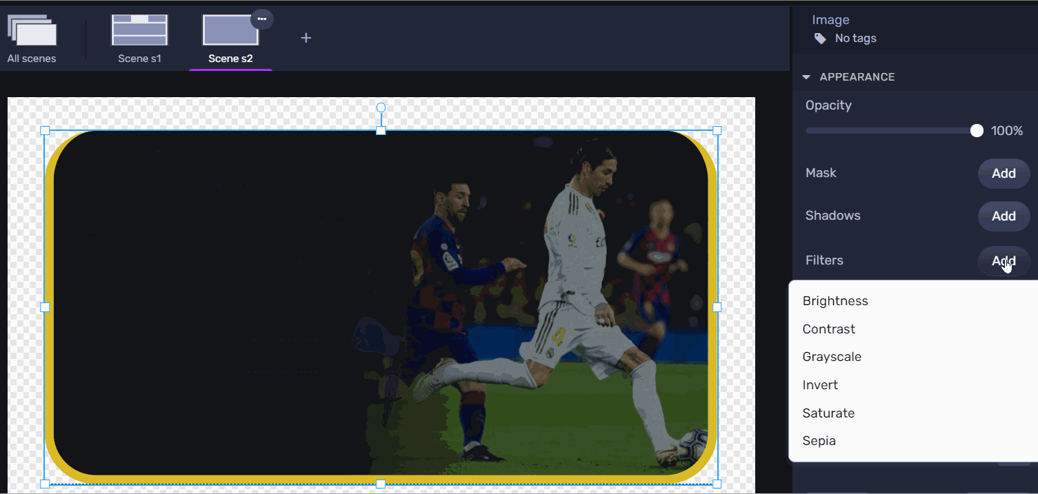
6. Sepia: Converts the image to sepia.
0% represents the original image.
100% will make the image completely sepia.
Note: Negative values are not allowed.

Borders
Borders

Style: Defines the sides and style of the border.
Width: Defines how wide the border will be.
Color: Choose a color for the border.
Radius: Increasing this number will round the corners of the rectangle.
Learn how to change these properties specific to borders by clicking here.
Remote Control
With the Remote Control, you can manage and decide when to trigger the overlay that contains the image on-air using the IN and OUT button.
Clicking on the gearwheel icon you can change or delete the Image during the live operation.
