
The Rectangle Element is a Building Block that can be used primarily as rectangular backgrounds behind certain elements as a Text, an Image, among others. Their borders can be rectangular or rounded, and its background can be fully customized with solid colors, gradients, or images.
Use Rectangles also to create geometric shapes.
Take into account, an Overlay will be created automatically if you did not add it to the Tree after adding an element.
To learn how to add elements to the Tree, click here.

The Rectangle Element has a default background color and does not support nesting. As the example above you can customize it with solid color, gradient, or using a pre-defined image.
Properties
Position and Size
Position and Size
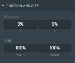
Position: Change the Rectangle position according to the X and Y axis (in percentage relative to the configured screen resolution).
Size: Change the Rectangle size inside the Canvas according to its width and height (in percentage relative to the configured screen resolution).
Although you can adjust the width and height inside the Canvas, you can also do this from the Inspector within the Position and Size setting, to keep consistency between elements.
Appearence
Appearence
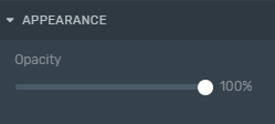
Opacity: Set the transparency percentage of the Rectangle.
Background Style
Background Style
Within the Inspector, you can modify the element backgrounds look and feel. It can be a solid color, a gradient, or an image.
Learn how to implement these properties specific to backgrounds by clicking here.
Borders
Borders
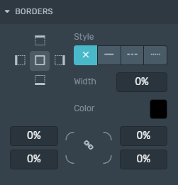
Style: Defines the sides and style of the border.
Width: Defines how wide the border will be.
Color: Choose a color for the border.
Radius: Increasing this number will round the corners of the rectangle.
Learn how to change these properties specific to borders by clicking here.