
Enhancing your design with customized backgrounds is easy! Follow these steps to add backgrounds to different elements:
Select Your Element: Start by selecting the element you want to add a background to. You can do this by clicking on it in the tree or canvas.
The elements that support a single or multiple backgrounds are:
Regions
Overlays
Containers
Rectangle
Progress Bar
QR Code
Ticker
Access Background Settings: Next, navigate to the Appearance section located in the Inspector panel on the right side of the editor and look for background. This is where you'll configure your background.

Click 'Add' once for a single background. To add multiple backgrounds for the same element, click 'Add' as many times as you need.
Choose Your Background Type: In the background settings, you'll find options for various background types:

Solid Color: Choose a single color to fill the background.
Color Bindings: Apply dynamic color bindings for a more interactive experience.
Gradient: Create a gradient effect with two or more colors blending.
Image: Upload an image to the Asset library to use as a background. Make sure it's relevant to your design.
Customize Your Background: Depending on the background type you choose, you'll have additional customization options. For example, you can adjust the color values, direction of the gradient, or scaling of the image.
Solid Color
Solid Color
To add a solid color pick the color from the picker, use the Hex code or RGBA values. Also, you can set the opacity to grant transparency to the background color.
Use it for example to generate a green screen for chroma key integrations.

Color Bindings
Color Bindings
Solid colors can also come from dynamic data. A data binding menu will show next to the Background picker whenever an element is children of some Data Provider that exposes string values.

Colors can be opaque or have an alpha channel (transparency), and can be defined in any of the following ways:
Use a keyword, such as "blue" or "red", that is part of the accepted list of CSS colors.
Using the RGB cubic-coordinate system, via the #-hexadecimal or the RGB() and RGBA() functional notations.
Using the HSL cylindrical-coordinate system, via the HSL() and HSLA() functional notations.
For more information about color syntax in CSS, check this MDN article. There are other possible syntaxes —such as lch(), lab(), or color()— but we don't recommend using them since they are poorly supported across browsers.
To bind any color, just click on the binding menu and pick a string from the source that represents a color.

As with any other strings in JSON, colors in data can be organized as:
A single, named string value
An object with groups of colors (e.g. to define swatches)
An array of colors

Color bindings also work with Google Sheet Providers, by binding a Background to a cell that has a text following some color notation:

Gradient
Gradient
After choosing the Gradient option on the Inspector, use the little pencils on top of the picker to pick the colors that will compose your gradient.
Click on the pencil to add the 1st color and then click on the pencil on the right to add the second color.
You can also move (in a horizontal line) each pencil to make bigger or smaller the area that will cover each color.
By default, gradient backgrounds move from the top to the bottom of an element, transitioning between the first color value and the second. This direction, however, may be changed with the use of a degree value stated.
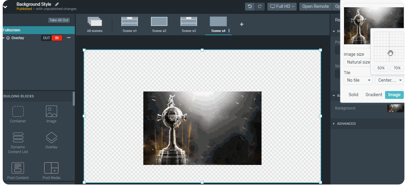
Image
Image
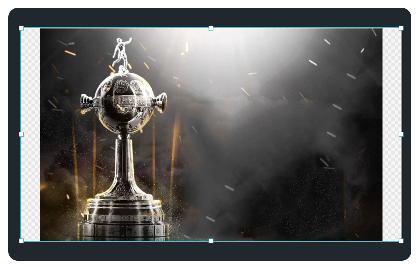
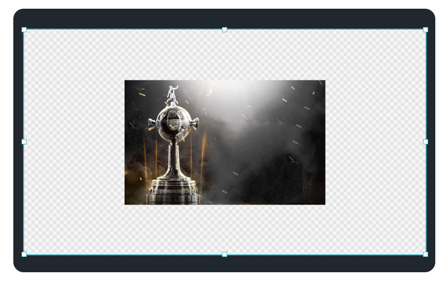
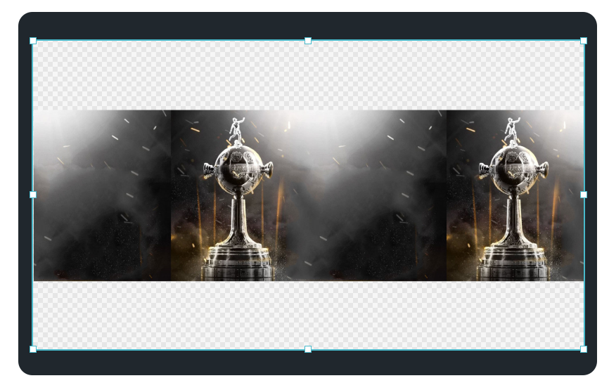
You can set an image as a background for your full-screen graphics or for example if you have already created your lower thirds as images you can upload them.
Supported formats
PNG
SVG
Animated GIF
JPG
WEBP
Max Size
Image max size you can upload is 5MB
Size
Size
Fit
The background image will scale until it gets contained on the Element’s Width or Height, keeping its original proportions and not cropping.
Transparent bands may appear if the image and the Element’s proportions are different. Those areas may be filled using the tiling options.
Fill
The background will scale until it covers the entire Element’s area, keeping its original proportions, but getting cropped if needed. You can use the position controls to move that cropping window.

Stretch
The image will stretch to fully cover the entire Element area, losing its natural proportions. This will be especially noticeable when there are big differences between the aspect ratios of the Element and the image.
No repetition or positioning adjust is possible in this mode.

Natural size
The image will be displayed on its original width and height in pixels.
If it’s bigger than the Element it will get cropped, and if it’s smaller it will leave transparent areas, that can be then filled with tiling.
Keep in mind that when using an image on its natural size, it will look bigger or smaller depending on the Graphics’ screen size (also set in pixels).
Title
Title
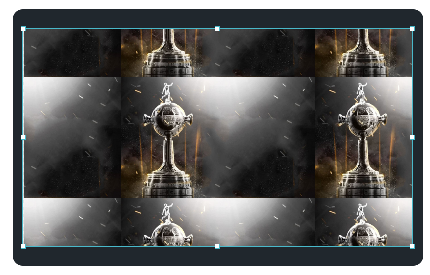
Allows you to set if an image is repeated. It works only with Fit and Natural Size. If you select one of those size options, you can choose to repeat it:
Horizontally (Tile X)
Vertically (Tile Y)
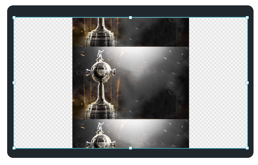
Both directions (Tile)
Position
Position
Allows you to set where the Background Image is placed. This option is not available for Image Size: "Stretch".
Multiple Backgrounds
A single element can have multiple backgrounds of mixed types layered on top of each other. Use the 'Add' button in the Background section to add a new background. Then, click on a background in the list to change its type or definition.

The background list can be reordered with drag and drop. This order will determine the layering of the backgrounds in the element, rendering the first ones on top of the last ones.
Solid colors and images can be data-bound. A binding button will appear next to the color input and image selector whenever a Data Connector is available in the Graphics Package. For solids, the bound variable must be a string representing a color value, such as a hexadecimal ("#00FF00"), an RGB ("rgb(255, 0, 153)"), a named color ("red"), or any other valid CSS color syntax.
For images, the bound variable must be a string with a valid image URL.