
The Progress Bar Building Block allows you to visually represent progress, advancement, or growth.
For example, it's commonly used to compare votes from Mechanics into your Graphics or to show percentage from a Flock To Unlock widget.
To learn how to add elements to the Tree, click here.

Properties
Use the Inspector (at the right-sidebar) to customize the Progress Bar:
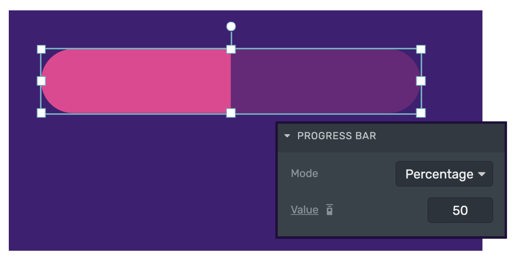
Progress Bar
Progress Bar
The Progress Bar has two possible modes: Percentage and Custom Values. The default mode is Percentage and it works by taking the provided value as a fraction of 100.
You can change to Custom Values from the Mode menu to use any value range you desire. This could be useful for example to use the Progress Bar as a velocity indicator.
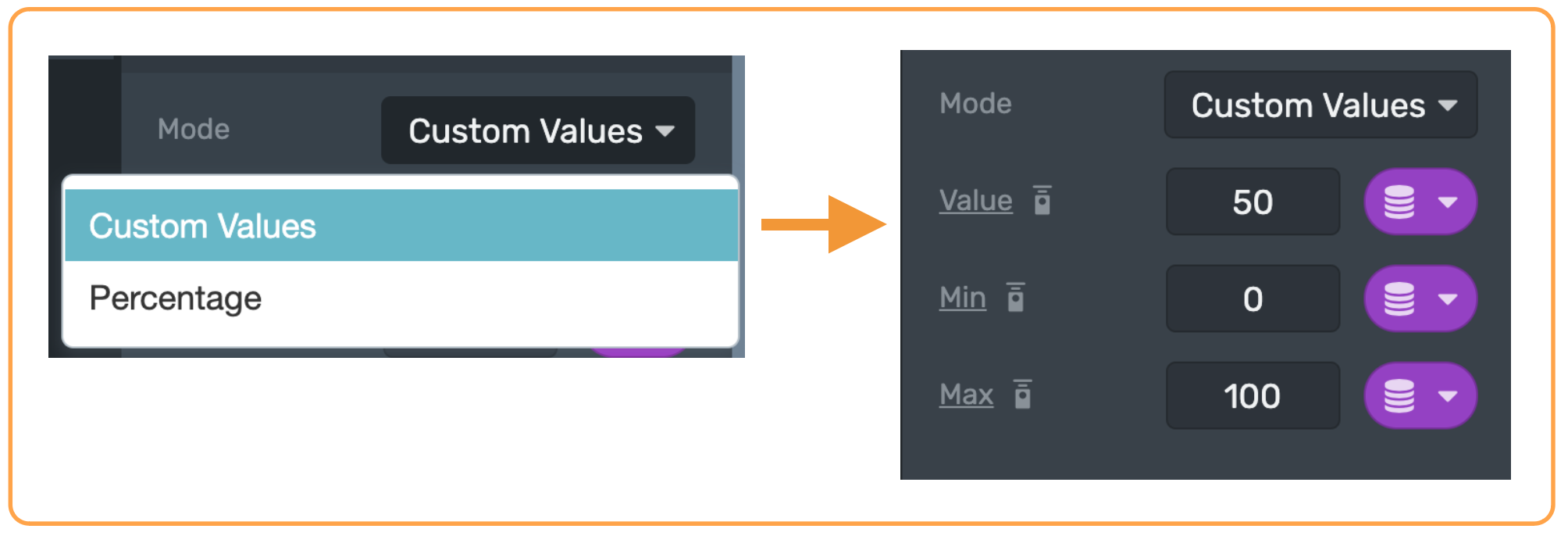
As you can see in the image, Value, Min and Max are able to be bound to a data provider value. They can also be exposed to the remote control.
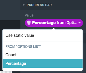
In the example above, The Progress Bar value has been bound to the Percentage data coming from a Mechanic Provider.
Appearence
Appearence
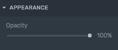
Opacity: Set the transparency percentage of the Progress Bar element.
Bar Style
Bar Style
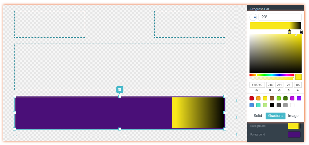
Background
Use solid color, image or gradient to style the background of Progress Bars.
Foreground:
Set the color, image or gradient of the foreground progress bar. This will represent the current percentage of your data.
Borders
Borders
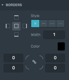
Style: Defines the sides and style of the border.
Width: Defines how wide the border will be.
Color: Choose a color for the border.
Radius: Increasing this number will round the corners of the rectangle.
Learn how to change these properties specific to borders by clicking here.
Conditional Visibility
Conditional Visibility
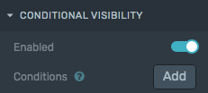
Add conditions for showing the progress bar or not. Also useful to highlight the right answer of a Trivia when it gets closed.